


Glasgow Music Scene
drawing experiments
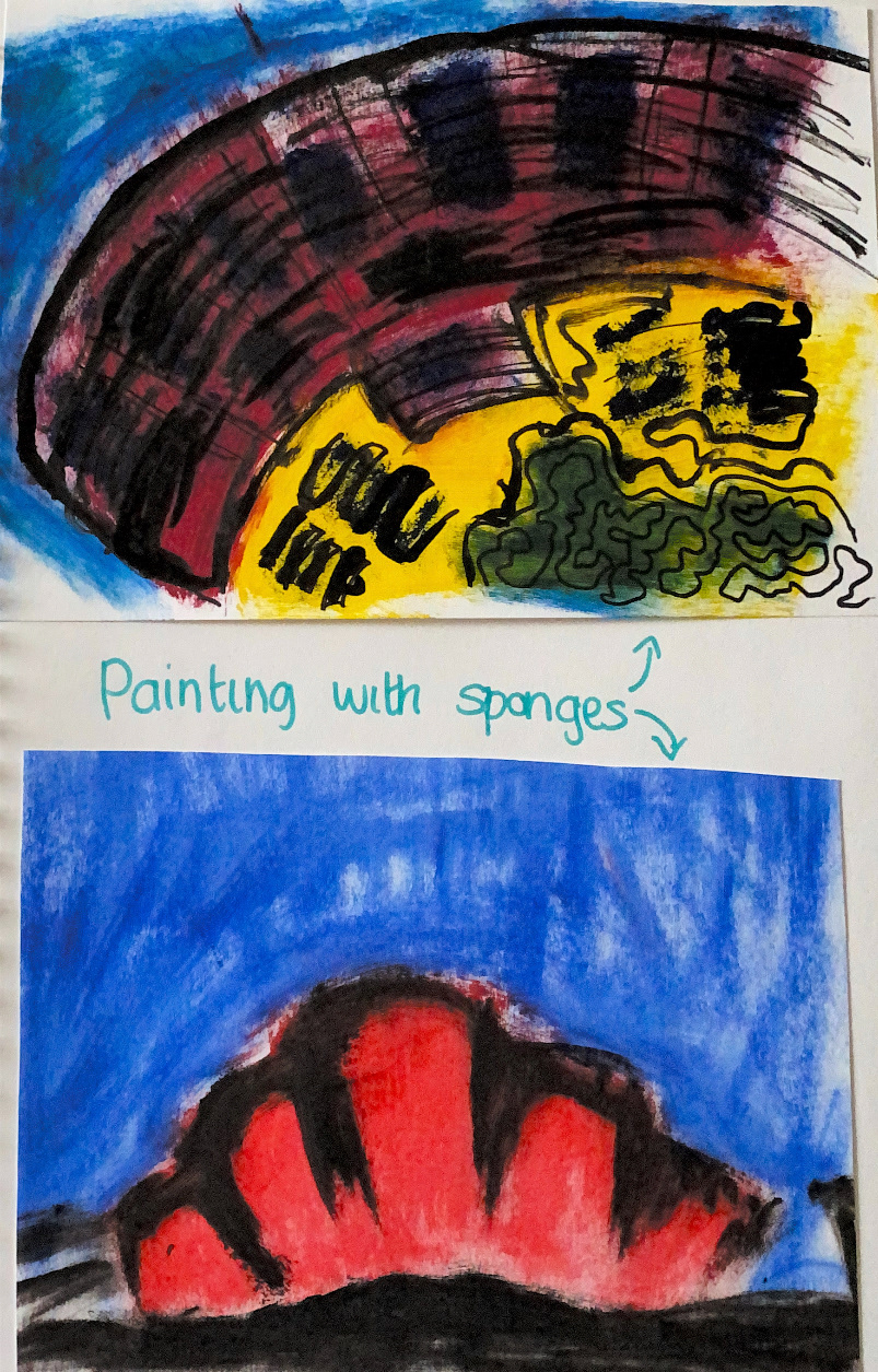
Paint experiments using sponges

The ABC is Burning
Acrylic paint and indian ink
This experiment was inspired by the O2 abc in glasgow. I used acrylic paint to create the general shape of the building, and smeared yellow and orange to signify the fire the building burning down a few years ago. I then used indian ink to make the piece look dirty and messy. I think this was quite a successful piece, even if you aren’t aware of the abc or what happened to it, it still is somewhat reminiscent of a building burning.

The Armadillo
Acrylic paint and indian ink
For my first development, I smeared extra paint I had prom a seperate piece and used indian ink to scribble a drawing of the Armadillo on top. I was surprised with how this turned out. I didn’t really think about what I was doing too much, trying to keep it simple, but I feel that the outcome was really effective. The simple black of the painting really stands out against the different colours of the background whilst complimenting the overall red tones well. However, as much as I liked this piece, I wasn’t sure how well this would translate into a risoprint. I think the background would all blend together, taking away from the effectiveness of the different brush strokes.

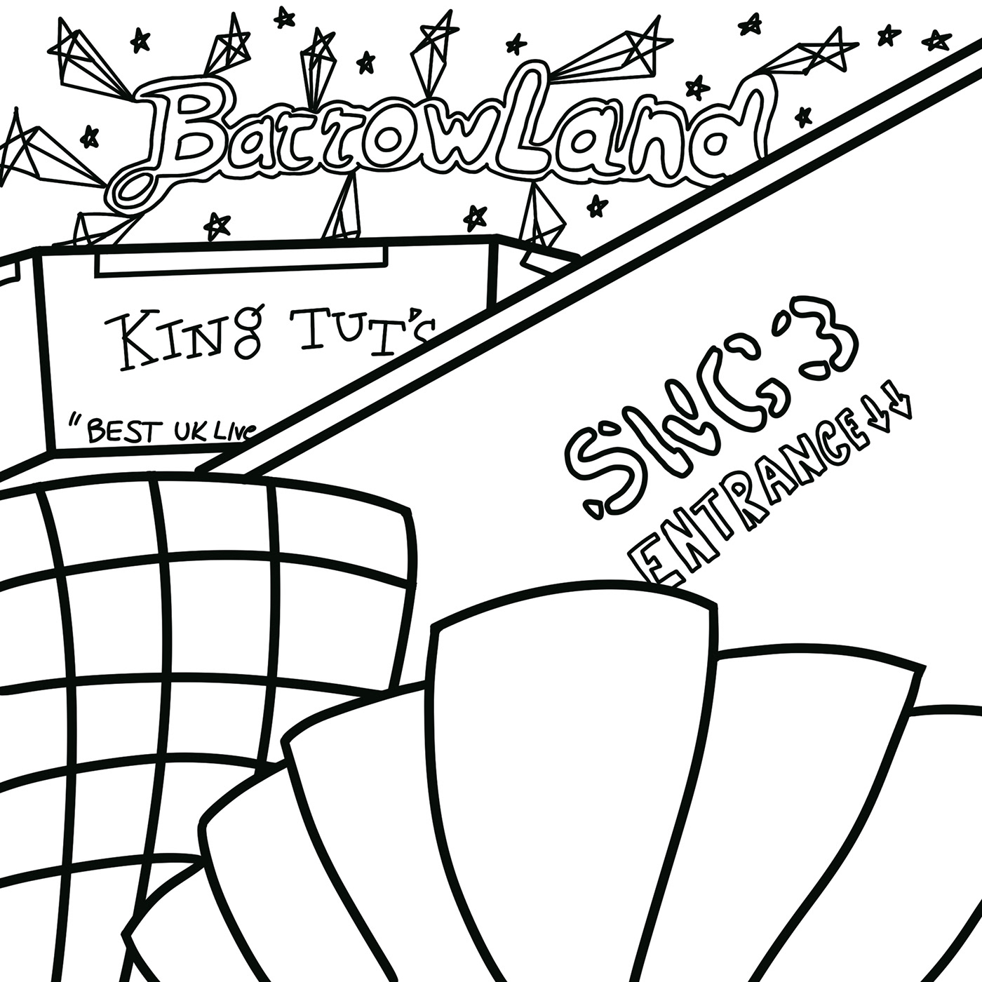
SWG3
Handwriting pen
Next I did a simple line drawing of the SWG3. I wanted to try out drains straight with pen as I feel as though the lack of control can create some really interesting results. This piece is awfully simple, however I really liked the illustrative feel to it, and feel as though it could be developed into something really nice down the line.

SWG3 in Charcoal
Charcoal on Paper
I then done another drawing of the SWG3 using charcoal. I covered a page in charcoal, then used a rubber to create the picture and drew into it to add tone. I am really happy with this piece as I feel as though the the simple black and white colour scheme brings out the different shades well. I particularly like the geometric style of it, with the drawing being made with almost exclusively lines rather than shapes. I also think the darkness of the building helps the writing and window parts of the picture stand out, giving the piece a lot of demension.

Glasgow’s Venues
Digital drawing
For this development I used prostrate to draw some of Glasgow’s most iconic concert venues, incorporating some of the most recognisable aspects of them. I then created a colour pallet inspired by some pop-art pieces as this is a style of work I am greately inspired by. For a first development, I was quite happy with this drawing. I really liked using the most recognisable aspects of the venues, and thinking about what parts and shapes would complement others. However, I felt that it looked a little too unprofessional and decided that for my final I wanted to focus on one venue and experiment with colours and style more than the subject matter, as I felt this better reflected my approach to art.

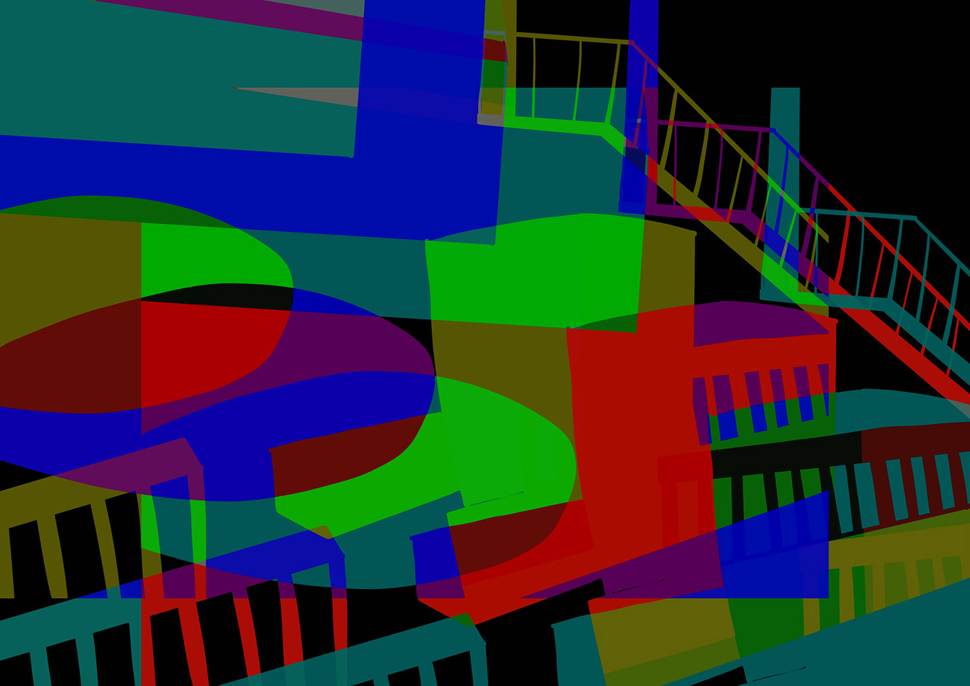
The Hydro X Armadillo
Digital drawing
Next, I continued with drawing digitally as I felt that it was a better suited medium for the pop art style I had chosen to follow. I drew the shapes of the SECC Hydro and the Armadillo, keep the shapes very simple, and Made sure they were overlapping. I then added colour interchangeably, using primary colours for more of a contrast between sections. I think it turned out really well, acting as a nod to the venues rather than a direct drawing of them. I think that this piece could also work well as a repeat pattern, almost creating a floral and/or shell design.
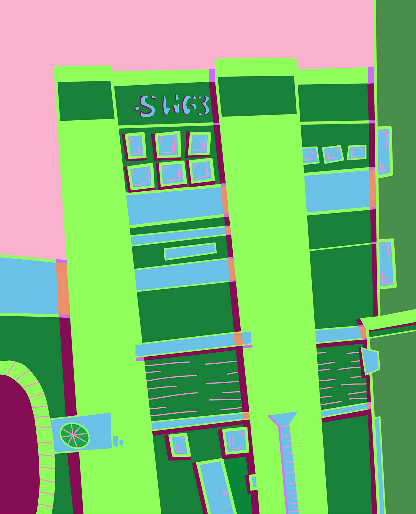
SWG3 in Colour
Digital drawing
Taking inspiration from a previous drawing, I drew the SWG3 again in more or a cartoon style. I used bright colours and imperfect shapes to create a more carefree and childlike drawing. I think this works really well, reminding me a lot of a 90’s kid’s show. I also really like the green and pink together as a I feel that they help each other stand out without overwhelming the viewer.

O2 Academy
Digital drawing
I then wanted to try out working with the chromatic aberrations tool in procreate. I started by drawing the O2 Academy in the same cartoon style as before. I then used the chromatic aberrations tool to add more layer to the picture.


The Glasgow Music Scene in Colour Block
Digital drawings
I thought that this created a really cool effect, replicating the flashing lights of a concert. However, adding too much detail drew away from the effect. I then tried it out with a few more drawings, taking inspiration from King Tut’s Wah Wah hut, they Hydro and the Glasgow Royal Concert hall. I Think working with block shapes really complimented the effect a lot better and helped replicate the simplistic style of pop art better. I also think that this style would work well as a risoprint, focusing more on colour and layers than details of the drawing.


‘Best Uk Live Venue’
Digital drawing
For my next piece, I once again drew a simplified version of King Tuts, focusing on using a warm colour pallet. I then drew the shape of the Hydro over the top, and filled it with the opposing colours of the drawing. I done this to draw a link between the history of the Glasgow music scene and the present. King tuts being a small long standing venue, having had some of the biggest artists in the world perform before their sucess. The Hydro is the opposite, only opening in 2013 with a capacity of over 14,000. I then drew around the shape of the hydro using the halftone tool in procreate to give the piece those pop art dots. I then made a collage of 4 different colourways to replicate an Andy Warhol inspired piece. I really love this drawing, even though I think there are too many different colours to work for a risoprint. I feel as though it ties my theme of the Glasgow music scene, and my love of pop art together well and definitely pushed me out of my comfort zone.

The Armadillo Reduction Print
Lino Print
While working on ideas for my final piece, I decided to try out a reduction print. I had never done one before, so decided to keep it simple and work from an original painting i had done of the Armadillo. I think the yellow background helps mask the imperfections, especially in the orange colour. I also think the ink all came out a whole lot more even with this one. While it’s not spot on, I feel as though the imperfect placement gives the print a bit of character, almost adding an extra sense of depth to it. Overall I am a big fan of this piece.
4 Colour Armadillo
Digital drawing
The first piece i done was a simple block colour drawing in procreate. I decided to recreate the reduction print I had made, adding in some darker sections to the building to act as a shadow. I think this is a nice idea as It gives the piece more dimension whilst still fitting with the pop art theme I have decided to go with.

Multicolour Armadillo
Digital Drawing
I then wanted to try out using the chromatic aberrations tool I had used on previous pieces as I really like how the the different shapes and colours create a whole new picture. I changed the background colour as I felt pink looked better with all the different colours. I think this is a nice drawing, and I am quite happy with how it turned out. However I feel as though it is a little too much for my final piece. With lots of different shapes and colours becoming a little too overwhelming.

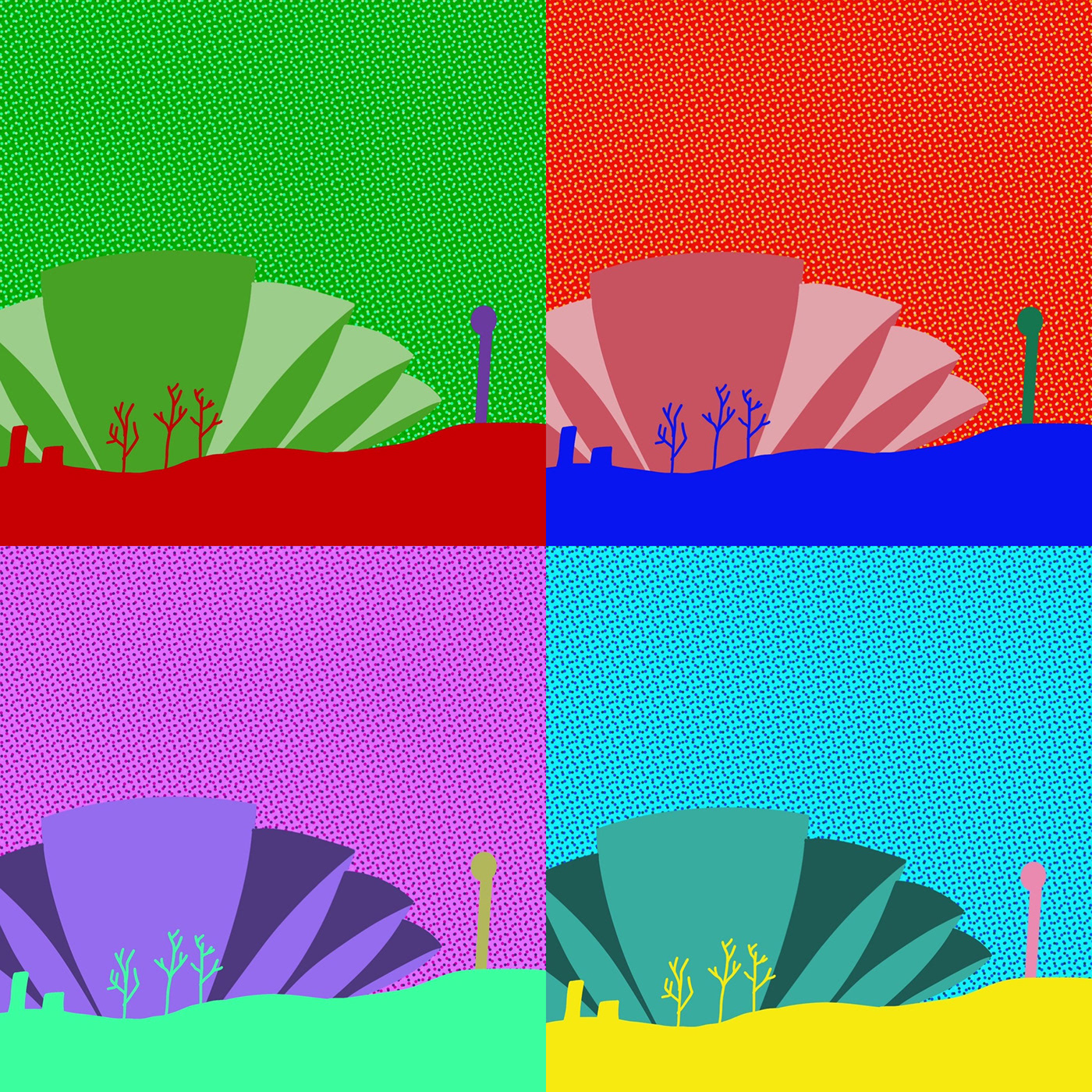
Armadillo in Colour Block
Digital drawing
Following my previous piece, I wanted to follow on from a drawing I had done of King Tuts, incorporating the dots often found in roy lichenstein’s work. I played around with different colour ways, and made a collage of 4 different ones, as I felt like this style is a staple in pop art. I liked this, however I felt that the first one had too much empty spaces. To combat this, I cropped the photos so that the building was off centre. I think this definitely helped the piece look a bit more professional, however I still felt as though it looked a bit empty.


Armadillo in the Clouds
Digital drawing
I decided to redo the piece, this time adding clouds and lines for shading as found in many of Roy Lichenstein’s work. I think this really helped fill out the drawing, making it look more like a finished piece. I also used the mirror tool to create the effect of the building reflecting in the water of the Clyde, which I think was a nice touch. I then changed the colour ways again, and made a collage. I liked this a lot more than the previous experiment. However, I didn’t like how each piece was in one colour scheme. For my final piece, I am going to play around with using more colours in my original drawing, to create a form of contrast rather than the drawing looking washed out.

Armadillo on the Water
Digital drawing
My initial plan was to create one more drawing that followed on from my previous developments and reflected Roy Lichenstein’s work, however this turned out to be harder than I anticipated. I started by drawing a photo of the Armadillo again, with the reflection in the water as I had previously done. I incorporated aspect of Lichenstein’s work, including his colour pallet and lines to to indicate shading. While I definitely think this piece mirrors Lichenstein’s, I wasn’t totally happy with it, but couldn’t pinpoint why.

The Face of The Armadillo
Digital Drawing
I then decided to try again and draw the building from a different angle, thinking it would reflect his work a bit better. This time i incorporates a path similarly to his work. I still wasn’t happy with it tho. While i could still see the similarities between this piece and his, it just didn’t feel it was finished, and I didn’t want this drawing to the finish to my project.


To combat this feeling, I played around with editing the colours of my drawings to try and make something I was happy with. However, I still wasn’t content. After starting my third drawing, I realised i wasn’t happy with it because it wasn’t how I would have drew it on my own accord. All of my previous pieces leaned more towards neon and contrasting colours, whilst lichenstein’s are slightly more muted. It wasn’t that I wasn’t proud of the drawings, they just didn’t reflect my own personal style This realised gave me a new appreciation for the drawings, and helped me feel content with my final piece.

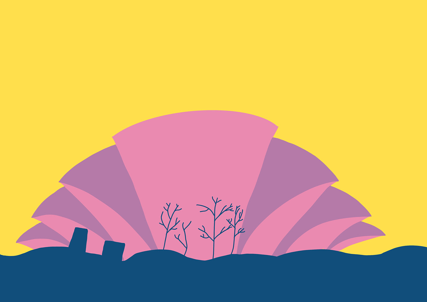
Blue Skies upon The Armadillo
Digital drawing
For my final drawing, I kept with the Roy Lichenstein inspired style I had adapted. I used a colour pallet inspired by his, and incorporated aspects of his work into mine, such as the clouds and trees. I am really happy with how it turned out. It definitely doesn’t look anything like what my initial thoughts relating to the brief were, however I think it’s been developed nicely over the course of the project. Making the decision to work in the style of Lichenstein helped me to work in a way that I am somewhat familiar with, whilst also pushing me out of my comfort zone. When I started the project, I thought I was going to go down the route of scottish clans for my final piece, then as I began experimenting, I thought for sure my final piece would be inspired by a more iconic concert venue, and would include a lot more neon colours. However, I am really proud of my final drawing. I found I really loved taking inspiration from the Armadillo as it is just such an unusual shape, and truly stands out from any other venue in Glasgow. Overall I think I have managed to develop my theme over a bunch of different drawings, experimenting with style and media, to create a really effective final piece.


